本节代码对应 GitHub 分支: chapter8
进度条组件是播放器中至关重要的组件,我们单独抽出来讲。
# 环形进度条组件
环形主要用于迷你播放器上,简单地运用 svg 来进行实现。
//baseUI/progress-circle.js
import React from 'react';
import styled from'styled-components';
import style from '../../assets/global-style';

const CircleWrapper = styled.div`
  position: relative;
  circle {
    stroke-width: 8px;
    transform-origin: center;
    &.progress-background {
      transform: scale (0.9);
      stroke: ${style ["theme-color-shadow"]};
    }
    &.progress-bar {
      transform: scale (0.9) rotate (-90deg);
      stroke: ${style ["theme-color"]};
    }
  }
`

function ProgressCircle (props) {
  const {radius, percent} = props;
  // 整个背景的周长
  const dashArray = Math.PI * 100;
  // 没有高亮的部分,剩下高亮的就是进度
  const dashOffset = (1 - percent) * dashArray;

  return (
    <CircleWrapper>
      <svg width={radius} height={radius} viewBox="0 0 100 100" version="1.1" xmlns="http://www.w3.org/2000/svg">
        <circle className="progress-background" r="50" cx="50" cy="50" fill="transparent"/>
        <circle className="progress-bar" r="50" cx="50" cy="50" fill="transparent"
                strokeDasharray={dashArray}
                strokeDashoffset={dashOffset}/>
      </svg>
      {props.children}
    </CircleWrapper>
  )
}

export default React.memo (ProgressCircle);
现在来把它应用到 mini 播放器中:
// 先 mock 一份 percent 数据
let percent = 0.2;
// 将原来的暂停按钮部分修改
<div className="control">
<ProgressCircle radius={32} percent={percent}>
<i className="icon-mini iconfont icon-pause"></i>
</ProgressCircle>
</div>
现在 20% 的效果就出现了。

# 线形进度条组件
现在我们来构建 normalPlayer 中的线性进度条,相信这也是大家会比较常用的一个组件。大家可能在平时的开发中,直接用的 UI 框架来完成,但你懂得背后是如何实现的吗? 现在就趁这个机会来试一试吧。
由于涉及到比较复杂的交互,我们这里做重点来讲解。
# UI 构建
首先构建 UI:
//baseUI/progressBar/index.js
import React, {useEffect, useRef, useState } from 'react';
import styled from'styled-components';
import style from '../../assets/global-style';
import { prefixStyle } from './../../api/utils';

const ProgressBarWrapper = styled.div`
  height: 30px;
  .bar-inner {
    position: relative;
    top: 13px;
    height: 4px;
    background: rgba (0, 0, 0, .3);
    .progress {
      position: absolute;
      height: 100%;
      background: ${style ["theme-color"]};
    }
    .progress-btn-wrapper {
      position: absolute;
      left: -15px;
      top: -13px;
      width: 30px;
      height: 30px;
      .progress-btn {
        position: relative;
        top: 7px;
        left: 7px;
        box-sizing: border-box;
        width: 16px;
        height: 16px;
        border: 3px solid ${style ["border-color"]};
        border-radius: 50%;
        background: ${style ["theme-color"]};
      }
    }
  }
`

function ProgressBar (props) {
  return (
    <ProgressBarWrapper>
      <div className="bar-inner">
        <div className="progress"></div>
        <div className="progress-btn-wrapper">
          <div className="progress-btn"></div>
        </div>
      </div>
    </ProgressBarWrapper>
  )
}
为了能及时看到效果,我们在 normalPlayer 中来引入这个组件。
import ProgressBar from "../../../baseUI/progress-bar/index";
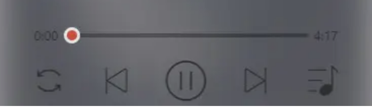
<ProgressWrapper>
<span className="time time-l">0:00</span>
<div className="progress-bar-wrapper">
<ProgressBar percent={0.2}></ProgressBar>
</div>
<div className="time time-r">4:17</div>
</ProgressWrapper>
ProgressWrapper 样式组件已经实现,现在只需从 style.js 引入即可。
现在,就可以看到基本的进度条的样子了。
# 进度条交互逻辑开发
首先,进度条组件作为播放器的一部分,我们思考一下将它被拆分出去后的功能,一方面是要响应用户的拖动或点击动作,让进度条得以长度变化,另一方面是要执行播放器组件传递过来的进度改变时需要的回调。
好,我们先完成第一步。
// 即将使用的 hooks
import React, {useEffect, useRef, useState } from 'react';

const progressBar = useRef ();
const progress = useRef ();
const progressBtn = useRef ();
const [touch, setTouch] = useState ({});

const progressBtnWidth = 16;

//JSX 部分
<ProgressBarWrapper>
  <div className="bar-inner" ref={progressBar} >
    <div className="progress" ref={progress}></div>
    <div className="progress-btn-wrapper" ref={progressBtn}
        onTouchStart={progressTouchStart}
        onTouchMove={progressTouchMove}
        onTouchEnd={progressTouchEnd}
    >
      <div className="progress-btn"></div>
    </div>
  </div>
</ProgressBarWrapper>
现在来处理滑动事件的逻辑:
// 处理进度条的偏移
const _offset = (offsetWidth) => {
  progress.current.style.width = `${offsetWidth} px`;
  progressBtn.current.style.transform = `translate3d (${offsetWidth} px, 0, 0)`;
}

const progressTouchStart = (e) => {
  const startTouch = {};
  startTouch.initiated = true;//initial 为 true 表示滑动动作开始了
  startTouch.startX = e.touches [0].pageX;// 滑动开始时横向坐标
  startTouch.left = progress.current.clientWidth;// 当前 progress 长度
  setTouch (startTouch);
}

const progressTouchMove = (e) => {
  if (!touch.initiated) return;
  // 滑动距离
  const deltaX = e.touches [0].pageX - touch.startX;
  const barWidth = progressBar.current.clientWidth - progressBtnWidth;
  const offsetWidth = Math.min (Math.max (0, touch.left + deltaX), barWidth);
  _offset (offsetWidth);
}

const progressTouchEnd = (e) => {
  const endTouch = JSON.parse (JSON.stringify (touch));
  endTouch.initiated = false;
  setTouch (endTouch);
}
现在进度条就可以自由地拖动啦!
不过还有一种情况,就是用户点击进度条的时候,进度条也应该做相应的改变。
其实很简单,绑定点击事件即可。
<div className="bar-inner" ref={progressBar} onClick={progressClick}>
const progressClick = (e) => {
  const rect = progressBar.current.getBoundingClientRect ();
  const offsetWidth = e.pageX - rect.left;
  _offset (offsetWidth);
};
现在我们就完成了第一步啦,接下来当进度改变后,我们需要执行父组件传过来的回调函数。
// 取出回调函数
const {percentChange} = props;

const _changePercent = () => {
  const barWidth = progressBar.current.clientWidth - progressBtnWidth;
  const curPercent = progress.current.clientWidth/barWidth;// 新的进度计算
  percentChange (curPercent);// 把新的进度传给回调函数并执行
}

// 滑动完成时
const progressTouchEnd = (e) => {
  //...
  _changePercent ();
}
// 点击后
const progressClick = (e) => {
  //...
  _changePercent ();
}
由于 percentChange 的具体逻辑在父组件完成,与目前组件无关 至此,进度条组件就开发完成了。
阅读全文


